~ 7 min read
Simple Introduction into D3.js
D3.js is a powerful JavaScript library for creating data visualizations on the web. With D3, you can bring data to life using HTML, SVG, and CSS. In this article, we will explore the basics of D3 and how to create some simple visualizations. We will cover topics such as selecting and manipulating elements, binding data, and creating scales and axes. By the end of this post, you will have a good understanding of how D3 works and be able to create your own data visualizations.
To get started with D3, you will need to include the D3 library in your project. This can be done using a script tag in your HTML file, like so:
<script src="https://d3js.org/d3.v4.min.js"></script>With the library included, you can start using D3 to create your visualizations. The first thing you will need to do is select an element in the DOM where your visualization will be placed. You can do this using the select method, which takes the id of the element you want to select as an argument. For example, if you have an HTML element with the id chart, you can select it like this:
const chart = d3.select("#chart");Once you have selected an element, you can use D3 to manipulate it in various ways. For example, you can set its attributes, such as the width and height of the element, using the attr method. You can also add styles to the element using the style method. For example, you could set the width and height of the chart element to 500 pixels and add a border like this:
chart.attr("width", 500)
     .attr("height", 500)
     .style("border", "1px solid black");
Another important concept in D3 is data binding. This refers to the process of attaching data to elements in the DOM. Once data is bound to an element, you can use it to drive the attributes and styles of the element. For example, you could bind a dataset of values to a group of rect elements in an SVG and use those values to set the height of each rect element.
To bind data to elements in D3, you first need to create a selection of elements to bind the data to. You can do this using the selectAll method, which takes a selector as an argument and returns a selection of elements that match the selector. For example, if you have a group of rect elements in your chart element, you can create a selection of those elements like this:
const rects = chart.selectAll("rect");Once you have a selection of elements, you can use the data method to bind your dataset to the selection. The data method takes your dataset as an argument and returns a new selection of elements, with the data bound to each element in the selection. For example, if you have a dataset of values like this:
const dataset = [1, 2, 3, 4, 5];You can bind this dataset to the rects selection like this:
const dataBoundRects = rects.data(dataset);Now that your data is bound to the elements, you can use it to drive the attributes and styles of the elements. For example, you can use the enter method to create new elements for any data that doesn’t have a corresponding element in the original selection. This is useful when your dataset is larger than the number of elements in the original selection. You can then use the attr and style methods to set the attributes and styles of the new elements using the bound data. For example, you could use the bound data to set the height of each rect element like this:
dataBoundRects.enter()
              .append("rect")
              .attr("height", d => d)
              .style("fill", "blue");
In this code, d is the data value that is bound to each element. You can access this value in a callback function passed to the attr or style method to use the data to drive the attributes and styles of the elements.
In addition to binding data and manipulating elements, D3 also has powerful tools for creating scales and axes. Scales are used to map data values to visual encodings, such as pixel values or colors. This allows you to create more meaningful and accurate visualizations of your data. Axes are used to add labels and tick marks to your visualizations, providing context and meaning to the data.
To create a scale in D3, you can use the scaleLinear method for example, which creates a linear scale that maps data values to pixel values. You can specify the range of the scale, which is the minimum and maximum pixel values, and the domain, which is the minimum and maximum data values. For example, you could create a scale that maps the data values in your dataset to pixel values from 0 to 500 like this:
const scale = d3.scaleLinear()
                .range([0, 500])
                .domain([1, 5]);
Once you have a scale, you can use it to map data values to pixel values using the scale method. For example, you could use the scale to map the data value 1 to a pixel value like this:
const pixelValue = scale(1);
// pixelValue will be 100
To create an axis in D3, you can use the axisTop, axisRight, axisBottom, or axisLeft method, depending on where you want the axis to be placed. You can specify the scale to use for the axis, as well as any other options such as the number of tick marks and the tick format. For example, you could create a top axis for your chart element like this:
const axis = d3.axisTop(scale);
chart.append("g")
     .call(axis);
With these basic concepts in mind, you can start creating your own data visualizations with D3.js. Whether you are new to data visualization or an experienced developer, D3 provides a wide range of tools and techniques for creating beautiful and interactive visualizations of your data.
Bring It Together
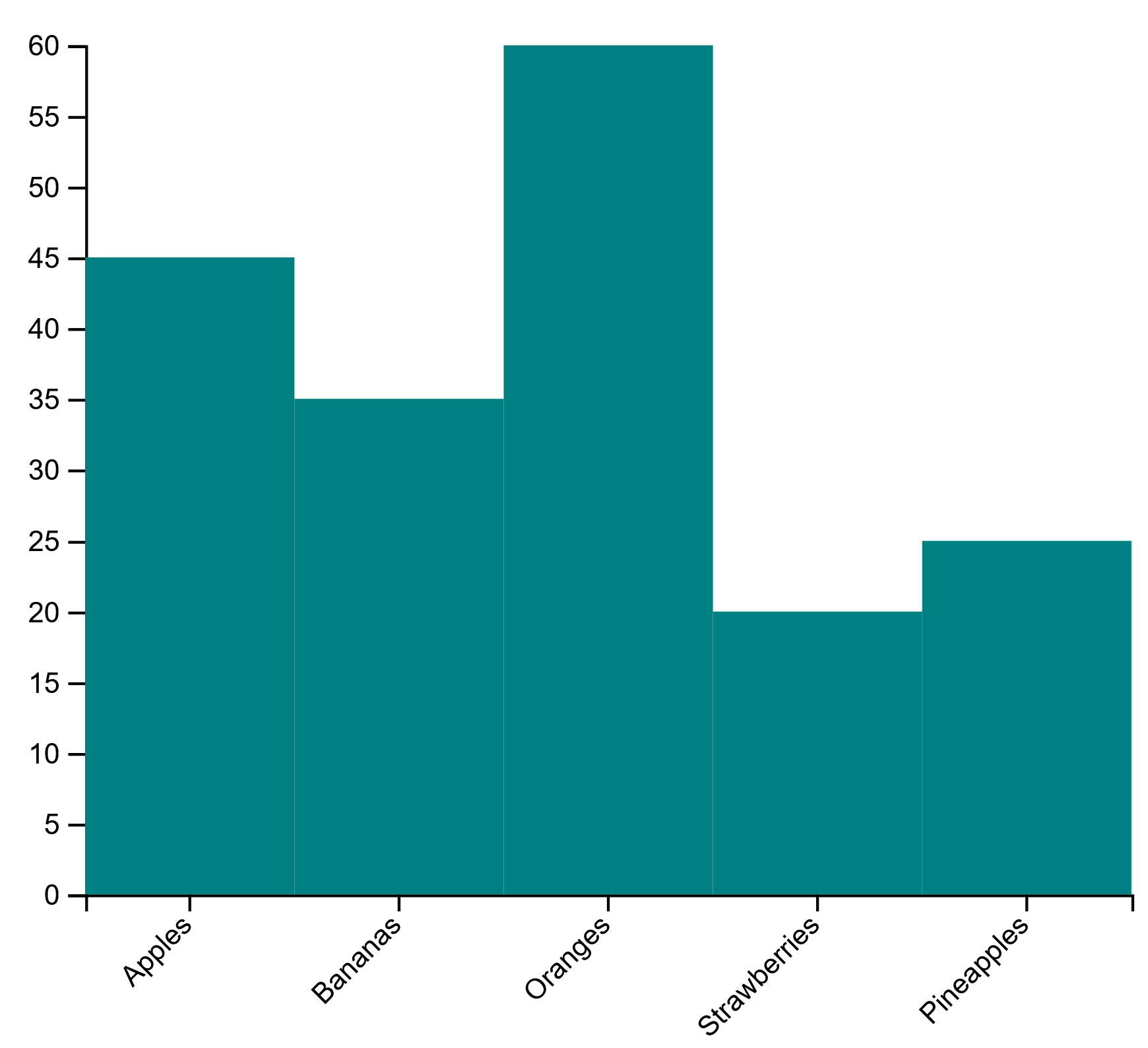
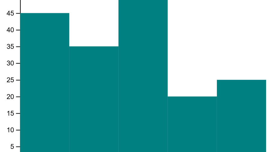
As a final example, let’s create a simple bar chart using D3.js. We will use the rect elements in an SVG to represent the bars in the chart, and bind a dataset of values to those elements to set their heights. We will also create a linear scale to map the data values to pixel values, and add a top axis with tick marks to provide context and meaning to the data.
First, let’s include the D3 library in our HTML file:
<script src="https://d3js.org/d3.v4.min.js"></script>Next, let’s create an SVG element in the DOM where we will place our chart:
<svg id="chart"></svg>Now, let’s create a JavaScript file and use D3 to select the chart element, set its width and height, and add a border:
var margin = {top: 30, right: 30, bottom: 70, left: 60},
        width = 460 - margin.left - margin.right,
        height = 400 - margin.top - margin.bottom;

    var chart = d3.select("#chart")
        .append("svg")
            .attr("width", width + margin.left + margin.right)
            .attr("height", height + margin.top + margin.bottom)
        .append("g")
            .attr("transform",
                "translate(" + margin.left + "," + margin.top + ")");
Next, let’s create a dataset of values that we will use to set the heights of the bars in our chart:
    var fruits = ["Apples", "Bananas", "Oranges", "Strawberries", "Pineapples"];
    var counts = [45, 35, 60, 20, 25];
Now, let’s create a linear scale to map the data values from our fruits to pixel values from 0 to width and add the names of the fruits to the x axis:
var x = d3.scaleBand()
     .range([0, width])
     .domain(fruits);
chart.append("g")
     .attr("transform", "translate(0," + height + ")")
     .call(d3.axisBottom(x))
     .selectAll("text")
          .attr("transform", "translate(-10,0)rotate(-45)")
          .style("text-anchor", "end");

var y = d3.scaleLinear()
     .range([height, 0])
     .domain([0, 60]);
chart.append("g")
     .call(d3.axisLeft(y));
Lastly, let’s use the enter method to create new rect elements for any data that doesn’t have a corresponding element in the original selection, and set the attributes and styles of the new elements using the bound data:
var bars = chart.selectAll(".bar")
     .data(counts)
     .enter()
     .append("rect")
     .attr("class", "bar")
     .attr("x", function(d, i) { return x(fruits[i]); })
     .attr("y", function(d) { return y(d); })
     .attr("width", x.bandwidth())
     .attr("height", function(d) { return 300 - y(d); })
     .style("fill", "teal");
With these steps, we have created a simple bar chart using D3.js. You can see the full code and the resulting visualization below: